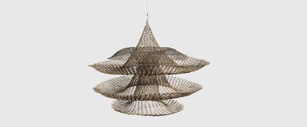
David Zwirner is pleased to announce an exhibition of sculptures and works on paper by American artist Ruth Asawa (1926–2013). Relentlessly experimental across a range of mediums, the artist is known for her works built on simple, repeated gestures that accumulate into complex compositions. The artist moved effortlessly between abstract and figurative registers in both two and three dimensions, creating a vast and varied oeuvre that, despite its visual heterogeneity, reflects above all her belief in the total integration of artistic practice and family life. The first solo presentation of Asawa’s work in greater China, the exhibition provides an overview of the artist’s wide-ranging practice, focusing in particular on her affinity for the natural world, which in turn provided a constant source of inspiration in her art.
David Zwirner is also pleased to present an exhibition by American artist Scott Kahn (b.1946), entitled Once in a Blue Moon, featuring a body of new paintings that focus on the full moon in various phases—with its myriad connotations—as their central compositional element. Also on view will be a selection of landscapes from throughout Kahn’s career, several of which include the moon, often glimpsed in the background, materializing as a sort of omen for the scene laid out beneath. Viewed together, these works exemplify the artist’s distinctive approach to the genre, showcasing his masterful use of formal elements to impart psychological resonances and heighten the theatricality of everyday experience. This will be Kahn’s first solo presentation in Asia and first with the gallery since his representation was announced in May 2024.
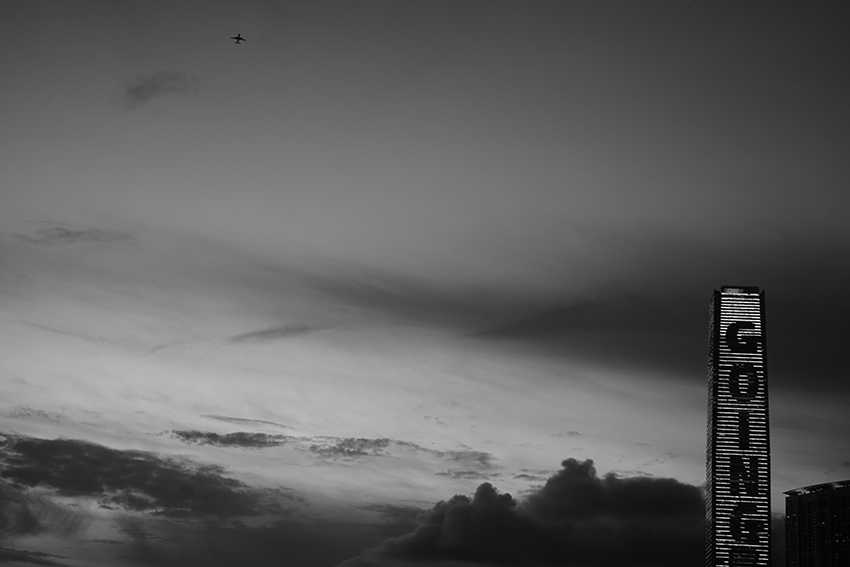
“Final bids” on an auction item are called and then, with hammer raised and nothing more from bidders, the auctioneer’s “Going, going” brings it to an end: “Sold!”
This photograph hasn’t much to do with auctions, but it was taken as Sotheby’s and Christie’s were both preparing a radical reorientation of their businesses in Hong Kong. Taking over a space previously occupied by fashion house Armani, Sotheby’s new first-floor retail outlet in Central’s Chater House will sell a range of artwork, including designer furniture and antiquities, on consignment – and, no doubt, dabble in art’s primary market, artwork directly from an artist: always a point of chagrin for galleries, who believe auction houses should deal only in the secondary market. At ground level is another large viewing space that will host the auction floor.
Meanwhile, Christie’s has taken space at The Henderson, Zaha Hadid Architects’ newly completed building in front of the Bank of China Tower and overlooking Chater Garden. The smart interior design, with movable panels and private client areas, is by Hong Kong-founded international architecture office Collective. Christie’s new Asia-Pacific headquarters covers 50,000 square feet over four interconnected floors. The seventh floor can be quickly converted from a viewing gallery into a dedicated auction room. Both auction houses will hold exhibitions and auctions throughout the year in their new spaces, replacing the large seasonal auctions they previously held at the Hong Kong Convention and Exhibition Centre.
GOING is a photograph taken as I was standing on the elevated walkway in front of the Hong Kong Cutural Centre alongside the Tsim Sha Tsui waterfront at dusk. I was focused on the changing illuminated text on the ICC building at West Kowloon. As “GOING” appeared, I realised a small speck on the far side of the camera’s viewfinder was an aeroplane. I very quickly adjusted the in-camera composition and had a moment to photograph it. I particularly like the day-to-night sky at the end of this hot Hong Kong summer day.
Although Gaylord Chan might not be a household name, anyone who regularly commutes on the Hong Kong MTR is likely no stranger to his artwork. On the walls of the passageway connecting Central and Hong Kong stations is a metal plate relief mural titled Swift and Safe that Chan completed in 1998. Vibrant and childlike, the work displays a bold use of colour and vital simplicity that are at the core of Chan’s artistic language.
Born in Hong Kong in 1925, Chan was one of the most original painters in the post-war period, and also served as a dedicated arts educator to generations of students and enthusiasts. Although he only made his first serious foray into painting at the age of 42, he quickly garnered attention as a promising artist in the 1970s after graduating from an extramural art and design course at The University of Hong Kong. Thereafter, he steadily developed a repertoire of abstract paintings and digital drawings over the span of five decades that continues to resonate with life in a rapidly globalising, increasingly technological world.
A Scarecrow by Gaylord Chan, Acrylic on canvas, 125 x 125 cm, 1979. Collection of Peter Lau. Courtesy Asia Society Hong Kong Center.
Chan grew up in a modest family as the elder of two children. His father passed away when he was very young, and he lived with his mother and sister on Lion Rock Road in Kowloon City. For a time, he attended a traditional Chinese private school (sishu) that focused on classical Confucian teaching. As soon as he was old enough to work, he joined the British telecoms company Cable & Wireless as a junior operator. Under the company’s training, he not only acquired fluent English but also rose through the ranks to become a certified engineer. One of his most significant achievements was serving as deputy manager for the construction of the Hong Kong section of the Okinawa to Luzon submarine cable in 1977. In 1985, he was made an MBE by Queen Elizabeth II for his contributions to telecoms.
Although Chan had always had an interest in art, he never had the leisure or means to pursue it in his youth. What finally motivated him to learn painting seriously was a mid-life tribulation – he enrolled in HKU’s extramural art classes in 1968 to alleviate a deep depression stemming from his first wife’s battle with throat cancer. He decided to enrol for certificate qualification, which required him to study a robust, three-year syllabus that included practical training as well as art history. The tutors were a star-studded cast that included the Austrian graphic designer Henry Steiner (b.1934); British curator John Warner (1929-2024), who was then also the curator of the City Museum and Art Gallery; and famed local artists such as Wucius Wong (b.1936), sculptor Cheung Yee (1936-2019) and Hon Chi-fun (1922-2019). According to Chan’s recollection, the most demanding classes were taught by the architect Tao Ho (1936-2019), and many eventually dropped out of them: he was one of only three students who managed to graduate in a cohort of 75.
Two years after graduating, Chan held his first major solo exhibition at The Excelsior hotel in 1973, debuting a naive style of painting featuring totemic forms. He coined this style “phylosym”, a term that he created by combining “phylosophical” [sic] and “symbolic.” If this was an emerging artist’s ambition to distinguish himself by coining a new style, he made little mention of it thereafter. He was never one to believe in labels, and “phylosym” seems more a word that he made up to appease a quizzical journalist than a new aesthetic that he wanted to leave in the art history books. As he once said:
“A lot of people confuse visual arts as a cognitive activity. When they see a painting, they ask, ‘What does this picture look like?’ But a painting doesn’t have to ‘look like’ anything, just as how we don’t listen to a piece of music and say it sounds like a cow or a bird. The sensations achieved by a mellifluous cadence make a piece of music. So why do we have to say what a painting looks like? This already means that we are not directly experiencing it.”
Monument for Those Still Alive by Gaylord Chan, Acrylic on canvas, 122 x 122 cm, 1983. Private collection. Courtesy Asia Society Hong Kong Center.
Painting was a medium to express his feelings, and he gravitated towards abstraction because he considered it entirely emotional: “What I understand as ‘abstraction’ is the taking away of mimetic representation. What will remain in a painting after that? I think only feelings.”
Chan was fond of using symbolism to express emotions and convey ideas, and the forms that he relied on often recall indigenous art and ancient artefacts. He was always open about his fascination for Inuit cultural objects, and that because he was studying them so often, they found their way into his paintings subconsciously. The recurring motifs in his paintings, such as tines, circular and elliptical shapes that are often nucleated, and spurred lines are all prominent features in prehistoric Inuit objects. At the same time, he took inspiration from sources as varied as ancient Chinese bronzes, paper cutting, shadow puppetry, traditional Indian textiles, Tarot cards, festive Cantonese flower plaques and trinkets from all over the world. He was invested in understanding how all kinds of form convey meaning, and he assimilated the logic of those that he considered most evocative, which was often the essential geometry that structures our world.
For all the references to folk and indigenous motifs, he painted many more pictures based on his daily observations. He had a habit of using a camera to capture inspiration; unassuming objects, from stationery to vegetables, all became vessels into which he channelled his thoughts and feelings if he saw fit. The art critic Nigel Cameron once likened Chan’s paintings to “fetish objects” because they are often larger-than-life portraits of a single motif. But when these works are considered in context with each other, certain thematic threads begin to surface.
Chan tended to transform mundane objects into unstable, often threatening instruments that betray anxiety about life’s uncertainties. For instance, A Scarecrow (1979) transforms something usually only frightening to birds into a gargantuan creature with thrashing tentacles that threatens to transgress the canvas. The anxiety that often underscores his paintings is unsurprising when we consider how he lived through some of Hong Kong’s most tumultuous, gruelling times. He came of age during the Second World War Japanese occupation of Hong Kong. At a time when locals in the city struggled to survive, he took up the mantle of the family and made dangerous treks over mountains to Yuen Long in the New Territories to source rice with a carrying pole. In the post-war period, he experienced Hong Kong’s rapid modernisation, alongside waves of refugees flooding into the city, rampant corruption and stark labour inequalities. Although he never expressed any social commentary in his paintings, the humble objects that come to life in strange contortions under his brush convey an overwhelming sense that life can grow sinister out of the blue. His lament for the folly of humankind is more subtly expressed in Monument for Those Still Alive (1983), a rare work in his career that directly alludes to warfare and death, after witnessing and surviving over half a century of social upheaval and loss.
Another related and perhaps more personal thematic thread that emerges from Chan’s oeuvre is confrontation with mortality. Growing up, he was an athletic thrill-seeker who loved hiking up Lion Rock mountain, camping in Sai Kung with his friends and swimming for hours on end in open waters, with a small blade strapped to him in case of sharks. Yet he was also afflicted by many ailments, including a case of appendicitis that required surgery without modern anaesthetic. Later in his adult life, he suffered from a series of major health problems, including a stroke that impaired his motor skills in 1998 and lung cancer in 2001 that made it impossible for him to continue painting. His personal struggles with his corporeal “cage” come through in many works that represent the body as fragmented or grotesque. For instance, Hang (1995) depicts some sort of broken alabaster statue missing its head and arms, but subtle shading on the figure gives it a dejected sense of life that is magnified by a seeming pair of leaden dumbbells weighing down on the decrepit body. Still, he was anything but a pessimist. As he proved resilient in every health battle, many of his paintings also resist mortality – Never End (1995) portrays a pair of cheeky buttocks being propelled by hurdling limbs that show no sign of stopping.
3 x 2 by Gaylord Chan, Acrylic on canvas, 92 x 122 cm, 2010. Collection of the artist estate (Chow Suk Fan). Courtesy Asia Society Hong Kong Center.
After Chan retired from permanent duties at Cable & Wireless, he became a full-time artist and founded the Culture Corner Art Academy (CCAA) in 1989 with fellow painter Josephine Chow. Located inside a shopping arcade in Tai Po, CCAA mainly catered to neighbourhood children and teenagers in the urbanising new town. But shortly after opening its doors, Chan also initiated a nine-month weekly acrylic painting course for adults. He was motivated by a simple question: is it possible to devise a single syllabus that can successfully teach students of varying capabilities how to paint? To this end, he recruited an inaugural class of six students with different backgrounds, including some who had no prior experience of painting. His instruction was largely distilled from what he himself was taught on HKU’s certificate course, but he also integrated his own experience and insight over the years to develop a pedagogy that aimed to help students discover their own interests and potential rather than training them in particular skills or styles. He summarised his teaching into a simple rule of thumb: “Fifteen-word truth: front and back, void and solid, light and dark, form, colour, texture” – a grammar of painting that he both preached and practised.
Throughout his career, he was particularly fond of using acrylic paint. The self-taught artist Ha Bik Chuen (1925-2009), a dear friend of Chan, once mentioned the latter’s growing reputation for acrylic:
“[Chan] has been playing with acrylic for over 20 years; word has it that he is now thought of as the ‘king of acrylic’. He is able to manifest the unique characteristics of acrylic in layers that are very thin and nuanced; his impressive technique comes through effortlessly. I’ve seen many who’ve used acrylic for a long time but only treat it as oil paint – they can’t demonstrate its quality. Acrylic can create different transparencies, some translucent, some opaque. He exploits this to vivid extremes.”
Chan was drawn to acrylic paint for its versatile range of viscosities and transparencies, starting when he was studying at HKU. As painting materials were too costly and storage space limited, he would sometimes paint over a work to create a new painting or do over a canvas when he was unhappy with the results. It was likely through recycling canvases that he discovered the charm of layering acrylic.
7 to the Nth Power by Gaylord Chan, Acrylic on canvas, 90.5 x 122 cm, 1995. Collection of the artist estate (Chow Suk Fan). Courtesy Asia Society Hong Kong Center.
As the artist developed his practice, some of his most intriguing works are those that make use of layering to explore the ambiguity of visual perception. 2022 (1992) is his most painstaking such achievement, putting his mastery of acrylic and colour on full display. Commissioned by the Hong Kong Museum of Art, this painting was part of the exhibition Hong Kong 2022, which commemorated the 30th anniversary of City Hall by asking artists to create an artwork that imagined 30 years ahead. Through careful short strokes of translucent colour, he depicts a subtle force swirling towards the centre of the canvas, as if into an intangible future. Compared to his paintings of symbolic glyphs, his abstract canvases exploring pictorial depth feature much more open and atmospheric compositions and a stronger reliance on brushwork. While some paintings use striking contrasts to suggest spatial narratives between different pictorial forms, others forefront the meticulous layering of colour to evoke mysterious expanses. Chan believed that colours could speak on their own, as more than just “adjectives” to forms.
In April of 1998, he suffered a stroke that severely impaired his motor skills. After he was able to return home from the hospital, he took to playing Microsoft Solitaire on a computer as a form of therapy, to retrain his eye-hand coordination. He eventually got so skilled at defeating the program that he grew tired of the game and turned his sights onto another application: Microsoft Paint. After he was diagnosed with cancer in 2001 and lost a quarter of his lungs, he turned to using MS Paint entirely to make art, as he could no longer sustain standing for long periods of time to paint on canvas. Despite its basic functions, MS Paint proved a rigorous medium that challenged him to think about form and colour in a new light. In older versions of the software that he worked with, the undo function could only retract a limited number of changes, and the eraser tool removed both figure and ground indiscriminately, as the same layer. These constraints meant that he not only had to construct a picture carefully but also think through the order in which he drew.
Hang by Gaylord Chan, Acrylic on canvas, 122 x 91 cm, 1995. Collection of the artist estate (Chow Suk Fan). Courtesy Asia Society Hong Kong Center.
MS Paint also encouraged Chan to extend his ideas on the relationship between form and time. Whereas his canvas paintings may have a rustic quality, from paring forms down to the essential, he intentionally created an anachronistic aesthetic in many digital drawings. He often simulated the effect of woodcut prints that recall the German Expressionist work of the early 20th century, which also inspired modern Chinese woodcuts of the 1930s and 40s. But the subjects depicted in these digital “woodcuts” are often still more archaic – an ancient Chinese ding vessel, beasts that evoke the Paleolithic cave paintings of Lascaux, and A tile from Dun Huang (2011). Throughout his career, one of the questions that engrossed him the most was how we are able to tell whether an object is from the present or the past just by looking at it. If his digital woodcuts conflating different eras into one image are his final attempts at tackling this conundrum, the answer is that we are never able to tell for certain. In his heart, he believed:
“A lot of what we now refer to as abstract painting, ancient Chinese splash ink had already done it before. There’s not much point in saying whether a work is abstract or not. What we need to think about is how to convey something very real, an actual feeling, through form, colour and texture – that is what we should do.”
Between this conviction and a lifelong interest in probing the temporality of forms lies Chan’s ambition to create works of art that are timeless. The artist’s legacy shows that art with the power to rouse visceral emotions has the best chance against the tides of time.
Featured image: SR III by Gaylord Chan, Acrylic on canvas, 122 x 184 cm, 1991. Collection of Hong Kong Museum of Art, AC1993.0026. Courtesy Asia Society Hong Kong Center.
Jérémy Garbarg As the 2019 « ADAMI Classical Revelation », Jérémy Garbarg embodies the new generation of the French cello school. Since 2021, he performs as a cellist with the Arod Quartet in the most prestigious venues around the world.
Anna-Li Hardel Anna-Li Hardel is a young French violinist who graduated from the Paris National Conservatory, specializing in violin and chamber music. She benefited from Jean-Marc Phillips and Louis Rodde’s teaching. A winner of several international competitions, she is passionate about chamber music and performs on French stages with the Lazuli piano trio. This trio has received awards and is supported by the Safran Foundation and the Maurice Ravel International Academy.
This performance is part of Ping Pong’s 10th anniversary programme which also includes Hongkong/Japan, an exhibition dedicated to the longstanding connection between Hongkong and Japan.
Australia-born, New York-based artist Jessica Rankin recently opened her first Hong Kong solo exhibition, Sky Sound at White Cube, which was two years in the making. It comprises 26 works of acrylic and embroidery on linen, and of acrylic, graphite, watercolour and thread on paper; coils of floating colour and shapes swirl and shift across the surface of her intimate and monumental works, intersecting with rigid lines of embroidered thread, a signature element of her work.
Rankin builds on the creative innovations of 1970s feminists like Judy Chicago and Margaret Harrison, who upended the traditional hierarchy and distinction between art and craft, bringing “women’s craft” and needlework into the contemporary art space, while at the same time developing her own distinct visual vocabulary. Embracing a fluid approach to media, Rankin uses brushstrokes and embroidery interchangeably, fusing the two with “masculine” fields like cartography, and incorporating geometric forms, astronomical signs and the written word to create an abstracted language.
The written word, in fact, has come to be as much a defining element in Rankin’s work as her use of embroidery. Throughout her career, she has incorporated words into her work: quotes from books, snatches of overheard conversation, thoughts, poetry and memories take shape and materialise, floating in thread across gossamer, canvas or paper. Although they are not as visually prominent in this exhibition, words are once again foundational to the thematic framework of the show.
Born in Sydney in 1971 to poet and playwright mother Jennifer Rankin and renowned painter David Rankin, the artist cites her mother’s poetic influence in this exhibition, fusing words with painting, and presenting a dialogue between paint and textile, as well as mother and daughter. Painting and embroidering on raw linen, instead of the diaphanous panels of sheer organdie for which she is best known, she embroiders in thread down the sides of the linen stretchers of many of the paintings. “After years of working on thin fabric, the very body of the stretcher feels like a sculpture to me and so the sides of the painting became as much a part of the painting as the surface. I found that language could sit there far more comfortably – like the spine of a book,” she says.
Building on her earlier map-inspired mindscapes, canvases and paper are awash with colour as pigmented waves, splatters, lines and shapes dance across the surface. Pigments bleed from geometric shapes into abstract, amorphous forms, from coolness into warmth, motion into stillness. On the ground floor of White Cube hangs the titular Sky Sound, JR (2024), a large, abstract painting composed of six intertwined circles against a background of unprimed linen.
This work, like many of the other canvases and works on paper featured in this exhibition, combines paint and embroidered passages drawn from poems, including by the artist’s mother – in this case, one titled Earth Web. A large, pale-yellow sphere is speckled with strokes of white at its left edge, radiating embroidered lines of pale blues mirroring the dazzling diamond-ring effect that occurs during solar eclipses. In this cornerstone of the exhibition, the artist delivers a celestial vision, merging the heavenly and earthly, the tangible and intangible. Dusky splashes of violet, indigo and white acrylic pigment unfold like ribbons across the surface, juxtaposed with delicate, rigid lines of blue thread radiating from a densely embroidered, black, cross-hatched orb. On the left side of the stretcher, the words of the title, “sky” and “sound”, are spelled out vertically in thread, the letters stacked on atop one another, and the words spaced out at either end of the frame. The outlines of a large, red circle, painted across the right side of the linen canvas, continue beyond the confines of the canvas and onto the other side of the stretcher. The flat stroke of paint is transformed, as if alchemically, and given dimension with embroidered red thread.
Rankin’s paintings are strongest when she allows for gestures and movement to float in space and breathe, and this is demonstrated best in her larger works. A playful dialogue between lightness and weight, paint and thread can be found across many of the works in this exhibition, as landscapes of constellations and mark-making emerge from spare expanses of raw linen. In With Words, JR (2024), a joyous firecracker of small feathery strokes of pink and watery washes of blue and smoky black pigment explode across the centre of the canvas, intersecting with the rigid, geometric, cross-hatched lines of embroidery, as Rankin tries to capture the language of brushstrokes through thread.
Hanging nearby, vertical composition Winging at the Edges, JR (2024) elegantly explores the relationship and tension between absence and presence, movement and stillness. Taking its title from the poem Earth-speak, the work visually invokes the poem’s opening line, “One rook winging at the edges of this sky”, bringing her mother’s poetry to life. We can make out what looks like a black bird frozen mid-flight, wings extended and skimming the edges of an embroidered radiating golden sun, like Icarus flying too close to it. Beneath it, a cascade of confetti in fuchsia, gold and black reflects a rush of wind or perhaps the flutter of a flock of birds. Again, the words of the title, “winging at the” and “edges”, are delicately embroidered in thread on either side of the vertical stretcher.
Rankin has a preoccupation with capturing the unseen or immaterial, and has cited modernist Swedish artist Hilma af Klint and German-American painter Agnes Pelton as inspirations. Both artists were also spiritual seekers, whose works were intended to convey transcendental messages to humanity. Rankin taps into a theosophical artistic visual lineage that strives to reach beyond the visible world. Standing among the paintings in the gallery, it is as if the artist is striving to pin down the fleetingness, intangibility and fragility of memory and emotion, of giving form to the mutability of water and wind, the essence of light, sound, breath, spirit and the disembodied.
A smaller square format work on linen, Fall Out of the Sun, JR (2024) features a fringe of looped, coloured threads spilling out of the canvas like ectoplasm, spiritual energy exteriorised by physical media, and arcing across the canvas in red, pink and turquoise. The surface is alive with movement and energy. In the painting And the Sky Rushed Down, JR (2024), a rush of wind, suggested by the title, is conveyed in the serpentine blue and white lines that descend from the upper edge of the canvas, crashing into a wave of water, giving rise to a dazzling sea spray, a jet of threaded lines and pointillist daubs of colour. A mediumistic quality is revealed as the artist enters into dialogue with her mother through her poetry, reaching beyond time and space, the earthly and the spirit, the poet’s words guiding skittish shapes and forms over canvas and paper. Merging internal and external worlds, the past and the present, the personal and historical, Sky Sound is an unfolding cartography of consciousness, emotion and the unseen.
另一邊廂是垂直構圖的《天際展翅, JR》(Winging at the Edges,2024 年),這幅作品優雅地探索存在與不存在、運動與靜止之間的關係和張力。畫作標題來自詩作《地球之語》(Earth-speak),在視覺上引用了詩作的首句:「烏鴉在天際翺翔」,活現了藝術家母親的詩歌。我們可以看到黑色的鳥在飛行期間凝住的一刻,牠展開翅膀,掠過刺繡而成、閃耀金光的太陽邊緣,就像希臘神話人物伊卡洛斯飛得太接近太陽一樣。烏鴉身下是連串紫紅色、金色和黑色的五彩碎屑,反照著突如其來的風,又或可能一群鳥兒拍翼飛過。同樣,標題中的「winging at the」和「edges」,在垂直底拉架的兩側以精緻的繡線表達。
蘭金著意捕捉看不見或非物質的事物,曾引用現代主義瑞典藝術家希爾瑪.阿夫.克里姆特 (Hilma af Klint) 和德裔美國畫家艾格尼絲.佩爾頓 (Agnes Pelton)為靈感來源。兩位藝術家同樣追求靈性,作品旨在向人類傳達超然的含義。蘭金運用了神智藝術視覺,致力超越可見的世界。身處畫廊被展出畫作包圍,可以感愛到藝術家在努力確定記憶和情感的轉瞬即逝、無形無相和脆弱,為了讓看不見的變成有其形狀,她為水與風加入可變性,為光、聲音、呼吸、精神和沒有形態的事物賦予精粹。
《從太陽掉下, JR》(Fall Out of the Sun,2024 年)是較小的方形亞麻布作品,環形彩色線圈像靈外質般從畫布流瀉,靈性的能量被物理媒體外化,並以紅色、粉紅色和綠松石色在畫布上拼出弧線,令畫面洋溢動感與活力。《天空湧下來,JR》(And the Sky Rushed Down,2024年)畫如其題,暗示一陣風從畫布上緣蜿蜒的藍白線條中吹下來,擊起一波以繡線線條和點彩畫色彩塗抹畫面,又令人炫目的海浪。藝術家以親撰的詩歌與母親展開對話,跨過時空、塵世和心靈,媒體特質悠然躍現,將詩人一字一句在畫布和紙張上化為靈動的形狀。內與外、今與昔、個人和歷史渾然糅合,「天音」是一幅連結意識、情感和看不見但一步步展開的地圖。
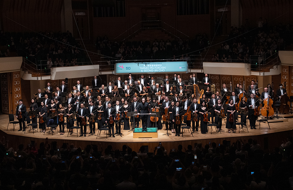
Concert Hall, Hong Kong Cultural Centre / Hong Kong / Jul 5, 2024 / Ernest Wan /
On 4 July, the Hong Kong Philharmonic Orchestra announced that the 24-year-old conductor Tarmo Peltokoski, of Finnish and Filipino descent, will become its music director in the 2026/27 season. Peltokoski had previously conducted the HK Phil in only one programme, in June 2023; following the announcement, his second ever engagement with the orchestra, which took place the very next day, was eagerly anticipated as an event offering nothing less than a glimpse into the orchestra’s future.
Tarmo Peltokoski conducting the Hong Kong Philharmonic Orchestra. Photo: Keith Hiro. Courtesy Hong Kong Philharmonic Orchestra.
This concert of new-found significance was ushered in by the muted first notes of Prokofiev’s Piano Concerto No 2 (1913, revamped 1923), with Seong-Jin Cho as soloist. The 30-year-old South Korean pianist loaded that unassuming opening theme with portent in the first movement’s huge, dense cadenza – which he performed with exceptional clarity – and thus lent its fearsome subsequent tutti restatement a sense of inevitability. In the intermezzo, which plods away like futurist machinery, Peltokoski savoured its many weird sounds, such as the loud low trill in the oboes near the start, executed with their bells up. In a delightful surprise, he had the movement’s pianissimoclose segue into the riotous fortissimobeginning of the finale, which was played extremely fast. Cho’s large leaps in this tempo were breathtaking.
While abrupt changes in tempo, dynamics and texture generated much excitement also in Peltokoski’s fleet account of Mahler’s Fifth Symphony (1902) in the second half of the concert, his handling of numerous passages that call for subtle shifts and smooth transitions, as in the flexibly sculpted adagietto and the incrementally accelerating coda of the scherzo, commanded still greater respect. At his generally high speeds – the entire performance lasted just 65 minutes – some momentous passages, especially those in the opening Trauermarsch, had perhaps less weight and hence emotional impact than contemporary audiences are accustomed to, but impressed both by the host of clearly audible details and by the conductor’s sober restraint. Apropos of speed, listeners might think that he turned the rondo-finale’s last bars into a mad dash, but he simply observed the prestomarking there that few others do. His mastery of the score and attention to detail were nowhere more evident than in the kaleidoscopic scherzo: the curt fortissimobelch on a single low E by all three clarinets amid quiet, delicate, molto espressivochamber music in the middle of the movement was signal enough of his grasp of Mahler’s phantasmagoric sound world. The musicians played with gusto throughout for the incoming music director.
Seong-Jin Cho playing Prokofiev’s Piano Concerto No 2. Photo: Desmond Chan. Courtesy the Hong Kong Philharmonic Orchestra.
At the previous day’s press conference, Peltokoski was repeatedly asked to articulate his vision of and aspirations with the orchestra under his future leadership, but stated little other than his intention to programme interesting and neglected works in the repertoire. Nevertheless, it’s a gratifying thought that the conductor’s honest, insightful music-making in this concert, so rich in interesting and neglected details, will characterise his work to come in Hong Kong.
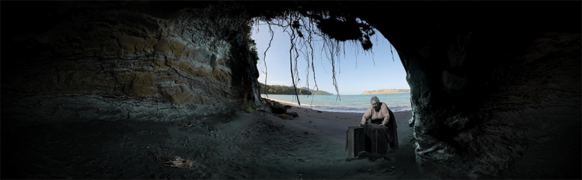
Tai Kwun is proud to present DigiRadiance: GOLD_LEAD_WOOD_COAL, an immersive digital exhibition on view from 2 to 30 November 2024 in F Hall Studio. Featuring a newly commissioned multi-channel video installation produced by the acclaimed Aotearoa/New Zealand artist Lisa Reihana, this exhibition, curated by Tobias Berger, brings together the far-flung islands of Aotearoa/New Zealand and Hong Kong. Based on the moving yet tragic story of the sinking of SS Ventnor, the video immerses audiences in an extraordinary fictional funeral procession from New Zealand to Hong Kong. The artist’s work draws on what is shared by these islands, including a strong maritime legacy and a history shaped by colonial forces—in a way following her distinctive blend of history and fiction in her large-scale video installation, in Pursuit of Venus [infected] (2015-17), when she represented New Zealand in the 2017 Venice Biennale.
In DigiRadiance: GOLD_LEAD_WOOD_COAL, Lisa Reihana explores issues surrounding foreign labour, longing, and displacement. The work takes us back to the late 1800s, shining light on the untold stories of Chinese gold miners who relocated to the Otago region on the South Island of New Zealand. Under tremendous hardship and severe living conditions, many died far away from their homeland and became “hungry ghosts”. Delving into this important part of history, Reihana revisits the story of the SS Ventnor, which in 1902 was en route to Hong Kong and Canton carrying coal and 500 boxes with the remains of the Chinese gold miners. During a storm, the ship sank close to a Māori settlement south of Hokianga on the North Island of New Zealand, where the Māoris found and gathered the lost remains and buried them ceremonially according to their customs.
Taking this historic tragedy as a starting point, Reihana weaves a speculative tale for DigiRadiance: GOLD_LEAD_WOOD_COAL. To tell the story, the artist uses impressionistic, theatrical imagery with first-person narration to reveal snippets of the saga, offering up four fictional characters: a Chinese merchant, a Maori Whine Wahine from Mitimiti who finds the bones on her beach, a female inmate incarcerated at Victoria Prison for stealing bread, and an Indian prison guard.
The curator Tobias Berger says, “Having a new commission by Lisa Reihana—and bringing together Aotearoa/ New Zealand and Hong Kong at Tai Kwun with such a sensitive and engaging installation—is a great chance to reflect on how Tai Kwun and Hong Kong’s history is deeply interwoven with the global Chinese diaspora. This new artwork reflects how often personal, tragic histories are kept untold, and how individual sacrifices become part of a larger narrative.”
GOLD_LEAD_WOOD_COAL is the second commission of DigiRadiance, a digital heritage programme transforming the F Hall Studio into an immersive project space. The ongoing project aims to reimagine and reinterpret the site’s historical buildings in a digital context, bringing visitors back in time in order to develop a deeper relationship with the buildings, and continue to value and treasure Tai Kwun. Last year, the inaugural exhibition used the radial plan prison of Victoria Gaol as a point of departure to revisit Tai Kwun’s prison history and its significance. This year, the project goes farther afield, seeking Hong Kong’s heritage beyond the city’s shores.
Asia Art Archive (AAA)’s 2024 Annual Fundraiser features an auction of over 50 works generously donated by artists, galleries, and individuals. This year’s fundraiser supports a crucial milestone for the organisation: building a premier digital archiving facility and training future archivists. These initiatives enable Asia Art Archive to provide free public access to resources on the histories of contemporary art in Asia. The works are now available for bidding online at www.aaa2024auction.com until 1 November, 10:30pm.
This year’s auction features work by artists including Ruth Asawa, Rosamond Brown, Luis Chan, Chan Ting, Patricia Perez Eustaquio, Naiza Khan, Leung Chi Wo, Qiu Anxiong, Ayesha Sultana, Tsang Kin-Wah, Wang Wei, and more.
Asia Art Archive enables free and open access to materials on the history of contemporary art in Asia through digitisation. As of today, AAA’s Research Collections contain more than 83,000 digital records. The fundraiser provides a vital source of funding to support AAA’s infrastructure in digitisation and advocacy for accessibility and custodianship.
The establishment of a Digitisation Lab will advance AAA’s archival standards and nurture the next generation of archivists. The enhanced infrastructure and expertise will give AAA the capacity to digitise 10,000 records per year—an increase of 148%.
These records illuminate the lives of influential artists, the histories of art and cultural organisations, and the intricacies of major exhibitions. In 2024, AAA launched several important archives spanning Hong Kong, South Asia, Taiwan, and more—including the archive of local artist Siu King Chung; Tozer Pak Sheung Chuen’s collection of Sunday Mingpao; the archive of Space II, Taiwan’s first cooperative gallery; and the Jyotsna Bhatt Archive, documenting the life of the eminent late Indian ceramicist.
We also anticipate upcoming collection launches, including that of Wang Gongyi (b. 1946), one of the few women artists who achieved recognition for her artistic and teaching career in 1980s China; Project 304 (est. 1996), a Bangkok- and Chiang Mai-based non-profit that shaped the landscape of Thai art communities; and Nalini Malani (b. 1946), a pioneer of new media arts who has galvanised Mumbai’s art scene since the 1970s.
Alisan Fine Arts, a stalwart of the Hong Kong art scene since its establishment in 1981, is proud to announce the grand opening of Alisan Atelier, the gallery’s new art & living space in Hong Kong’s Southside on 26 October 2024. Spanning over 10,000 square feet, the new space is a dramatic expansion of the gallery’s previous location in the same building. Alisan Atelier includes a gallery, library, museum-grade viewable art storage, and various project and entertainment spaces – a one-stop art hub where diverse artistic forces and multi-disciplinary knowledge converge and cross-pollinate. The global headquarters in Central continues to spotlight established artists and the gallery’s leadership in new ink art, while Alisan Atelier provides a platform for emerging talents and diverse artistic practices. This dual approach aims to bridge generations and disciplines within the art world.
To celebrate this occasion, Alisan Fine Arts proudly presents Remaining the Mountain, Becoming the Ocean as the inaugural exhibition of Alisan Atelier, featuring the first joint showcase of artist duo Mok Yat-san and Man Fung-yi. Featuring 22 recent works across sculptures, installations, video, ink paintings, this exhibition is a meditation on the concept of duality and companionship, offering insights into the duo’s creative process and the philosophical underpinnings of their art.
Michael Wolf, Ichi Tashiro, Izumi Kato, Eika Kato, Taka Principal, Mariko Jesse,Miyuki Kume, Hiro Yoshikawa, Bernard Leach, LAAB, Ryuji Miyamoto, Bruce Blue Blood Hongkong/Japan Oct 16, 2024 – Jan 16, 2025
Ping Pong Gintonería 129 Second Street L/G Nam Cheong House Sai Ying Pun, Hong Kong +852 9035 6197 Tuesday – Sunday, 6pm – 10pm
This is an art, architecture and design show about the longstanding collaboration between Hongkong and Japan. Starting with the work of Eika Kato, who painted here in the 1910 and 20s, and Bernard Leach, the renowned 20th-century potter who was born in Hong Kong and journeyed to Japan to learn his craft, the show goes on to contemporary artists and designers working in Hong Kong.
The exhibition is part of Ping Pong’s 10th anniversary celebrations.