Warring States Cyberpunk /
Tai Kwun Contemporary /
Hong Kong /
Dec 9, 2023 – Mar 3, 2024 /
Futuristic DIY attitudes, military-style uniforms, grimy tech gear and the “high tech, low life” motif—the aesthetics of cyberpunk saturate our visual media so much that its countercultural origins are drowned out in its neon glow. Maybe this is because fiction is spilling into real life, and our survival instincts are kicking in as the consumer technology presented to us becomes increasingly enmeshed with our daily activities, algorithms and capitalistic overdrive shaping new habits without us realising.
Invoking cyberpunk in East Asian metropolises such as Hong Kong and Tokyo is a dicey proposition. It’s too easy to let the look of things overshadow the big ideas. But that didn’t stop animation director and visual artist Kongkee (aka Kong Khong-chang) from using the genre as one of his starting points in the show Warring States Cyberpunk, in which he layered imagined undertakings and musings of Qu Yuan, a poet whose suicide by drowning inspired the annual Dragon Boat Festival, over the stylistic choices typically associated with cyberpunk.
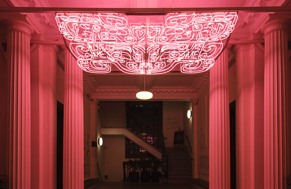
Naturally, it all starts with neon, a medium that’s as hip as ever, even though the trade behind it is on its last legs. Kongkee’s show at Tai Kwun begins with Taotie (2022), a pink lighting installation with a name drawn from one of four evil creatures in ancient Chinese myths. Playing off the beast’s gluttonous nature, Kongkee knits in the logos of familiar social media and messaging apps, with the phrases “Like Me” and “Love Me” meshed into a familiar form found on bronze artefacts. The piece is heavy-handed commentary on human connection in the 21st century, but works to prime the rest of the exhibition.

Warring States Cyberpunk drips with references to Hong Kong and its past. Kongkee’s signature colour scheme – dramatic greens and subtle blues, bleeding into magenta tones, cast in hues of bright yellow – was common in the product designs of a previous generation. Scenes and settings in his animated films are lifted from the city’s streets and architecture. The characters in Kongkee’s animations – the poet Qu Yuan, his liege the Chu emperor, and Qin Shi Huang, who created a unified Chinese empire – are also familiar to any Hongkonger who wanders into the screening room.
The three animated shorts – Dragon’s Delusion: Preface (2020), Dragon’s Delusion: Assassination (2018) and Dragon’s Delusion: Departure (2017) – transplant those characters from ancient China into Kongkee’s imagined alternate history. Androids and cyborgs walk among us, cassette tapes are fragments of human souls, and Qin Shi Huang made his dream come true and found a way to live forever.

In Cantonese with Chinese and English subtitles, 2020.
Dragon’s Delusion: Assassination by Kongkee, Digital animation, 10min 37sec, colour.
In Cantonese with Chinese and English subtitles, 2018.
Dragon’s Delusion: Departure by Kongkee, digital animation, 8min 2sec, colour.
In Cantonese with Chinese and English subtitles, 2017. Courtesy the artist and Tai Kwun Contemporary.
The world portrayed in Kongkee’s animations is bleak. There isn’t much choice for people to remain fully biological; everyone is forced to fuse with machines so they too can extend their lifetimes without end. Meanwhile, the Qin empire persists for millennia, with one man at the top of the totem. The emperor survives an assassination attempt, then retreats to his private chambers, where he rewinds a cassette tape to mend his wounds. This appears to move his physical state back in time, then forward again as soon as he’s back to being in the pink of health.
It’s difficult to read into the animations and see much other than the compulsion to lash out against a centralised authority, particularly one that is obsessed with uniformity and decorum.
Kongkee and his collaborators didn’t just set out to create an animated trilogy. They set out to create a feature drawn specifically for the city – locally funded, then locally made. When the credits rolled, one could spot the names of Hong Kong artists who backed the project by pouring cash into it.
Call Warring States Cyberpunk a homecoming of sorts, with Kongkee’s work recast to connect with viewers more intimately than before, knit together using Hong Kong’s visual grammar. The works in the presentation had previously been exhibited at San Francisco’s Asian Art Museum and Wrightwood 659 in Chicago, but there’s deeper meaning in showing them in a city that Kongkee calls home.
Featured image: Taotie by Kongkee, Neon, site-specific installation, 300 cm × 121.5 cm, 2022. Courtesy the artist and Tai Kwun Contemporary.
戰國龐克
大館
香港
2023年12月9日至2024年3月3日
未來主義的DIY 態度、軍裝風制服、髒兮兮的科技裝備還有那「高科技、低生活」的主題——賽博龐克美學充斥著我們的視覺媒體,以至於其反主流文化的起源已淹沒在明亮的霓虹燈之下。這或許是因為虛構小說裡的情節正蔓延到現實生活中,還有由於消費科技日益融入日常活動,過度運作的演算法和資本主義在不知不覺中塑造了我們新的習慣,令我們的生存本能開始被激發。
將賽博龐克引入香港和東京等東亞大都市是個冒險之舉。事物的外觀很容易會掩蓋其宏大意義。但這並沒有阻止動畫導演兼視覺藝術家江康泉(又名江記)以此流派為主要出發點創作了展覽「戰國龐克」。其中他構想了屈原的行動與思考並糅合在賽博朋克風格中。投江自盡的詩人屈原是一年一度的端午節的起源。
一切自然而然地從霓虹燈開始,雖然這一媒介已瀕臨沒落但依舊時髦。來到江記在大館的展覽,首先看到的作品《饕餮》(2022年) 是一個粉色燈光裝置,名字取自中國古代神話中的四大邪獸之一。江記在作品中演繹了此怪物的貪婪本性,青銅器上常見的徽標變成了慣用的社交媒體和短訊應用程式的公司標誌,並附上短語「Like Me」和「Love Me」。這個作品抨擊了21世紀的人際關係,並為展覽的其餘部分奠定了基調。
「戰國龐克」不斷提及香港和其過去。在洋紅色調中滲入誇張的綠和微妙的藍而後投射出明亮的黃色,江記這標誌性的配色方案常見於香港上一代的產品設計裡。其動畫電影中的場景及環境均取材於香港的街道和建築。此外其中的人物,詩人屈原、他的君主楚王、以及統一中國的秦始皇,對於任何一位走進放映室的香港觀眾來說都是熟悉的。
在動畫短片三部曲:《離騷幻覺—序》(2020年)、《離騷幻覺—刺秦篇》(2018年)和《離騷幻覺—汨羅篇》(2017年)裡,這些中國古代人物穿梭到了江記構想的另一歷史宇宙中。在那裡機器人和改造人行走在我們中間、卡式錄音帶是人類的靈魂碎片、秦始皇實現了他的夢想,找到了長生不老的方法。
江記在動畫中描繪的世界是淒涼的,人們無法保持肉體上的完整,為了無限延長壽命,他們被迫與機器結合。與此同時,秦帝國延續數千年,卻獨有一人立於圖騰之巔。皇帝在一次暗殺中倖存下來,隨後撤到寢宮,用一盒卡式錄音帶回帶來治癒傷口。他的身體狀況像是被倒回過去,直到恢復健康後立刻去帶回到當下。
觀看此動畫,很難不看到其中對中央集權尤其是癡迷於統一和禮儀的政權的奮起反抗。
江記和其合作者不僅旨在創作一部動畫三部曲,而是專為這座城市量身打造的作品——本地資助、本地製作。當片尾致謝字幕滾動時,觀眾可以看到為該項目贊助資金的各個香港藝術家的名字。
「戰國龐克」可以說是一種回歸,江記通過在作品中融入香港視覺語言,與觀眾建立起比以往更緊密的聯繫。是次展出的作品此前曾在舊金山亞洲藝術博物館和芝加哥Wrightwood 659博物館展出,但此次在江記稱之為家鄉的城市展出則有著更為深刻的意義。